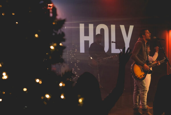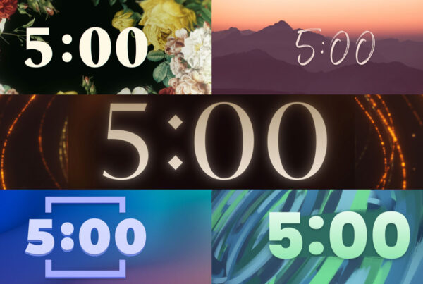

Every font tells a story. How its lines curve, the thickness of its strokes and how wide the typeface stands are only just a few of the characteristics that tell its tale. The typeface used in this article, like most typefaces, tells a story that is studious and undramatic. It does not stand out on its own, it is easy to read, its letters form nicely together to create words and it is pleasant to read for long periods of time. On the other hand a typeface like this tells a different story. Its narrative is bolder and flirty. The chosen typeface for your projected text needs to be intentional. Randomly chosen typefaces might be telling the wrong story.
Be intentional about the fonts you choose. Communicate text clearly and never sacrifice legibility for stylization.
The key to creating a professional, organized and easy-to-read presentation is consistency. Once you are confident in your chosen styles, attributes and fonts, you need to stick with them. This will create a consistent experience for your community. The more inconsistent slides are from each other, from verse to verse or from song to song, the more noticeable and distracting they will be for your viewer. Only slide designers with a lot of experience should try combining different fonts together to communicate various themes. Be intentional about how your type looks because being reasonless makes your design meaningless.
To learn more worship lyric projection best practices read The Worship Media Handbook.