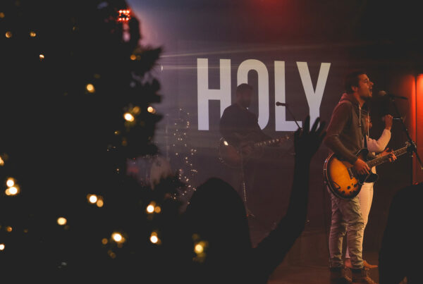

Drop shadows are a popular tool for separating white text from its background. The more neutral the background, the more helpful a drop shadow can be in separating the foreground text. With the correct settings a drop shadow can be an unobtrusive way to make text more legible on your screen.
A few key points to consider when using drop shadows are:
- A drop shadow can be subtle and still be effective
- Adjust your shadow’s distance value just enough to help lift the text off its background
- Always use the color black for your drop shadow
- Blur your shadow to make its edges softer. This creates a more natural look than a hard-edged drop shadow
- Heavy drop shadows can overpower your text and should be adjusted to be more subtle
- Never use a black drop shadow on black text without using a white stroke as well
- Use a direction angle of 180 degrees so your shadow falls straight down. Do not settle for the default 130 degree angle
- Use an opacity level of 50 to 100 percent
One weakness of the drop shadow effect is that the bottom portion of your letters will be more visually separated from the background than the top. This is because a drop shadow is offset from the text by a specified distance. Having a distance of zero would remove the offset effect and create a glow around all the edges of your letters equally. This is a unique effect to help separate your text from its background while keeping a flatter look to your design.
Use a drop shadow distance (or length) of approximately 5 to separate your text from its background. Higher numbers will exaggerate your shadow effect and may be less effective in separating your text from the background. Smaller numbers will decrease your shadow effect and make it more hidden behind your text.
Be careful not to have so heavy a drop shadow that it overpowers your text. Use other tactics and effects such as strokes and heavier-weighted fonts to help your text stand out instead of cranking up your drop shadow settings.
To learn more worship lyric projection best practices read The Worship Media Handbook.