Purposely crafted worship slides can have a huge impact on your church’s services. On the other hand, poorly designed slides can leave your audience confused or distracted from the main reason that they’re there – to worship. In this post, we’re sharing 5 tips from our new ebook, The Worship Media Handbook, to help you correct some of the most common mistakes seen on worship lyric slides.
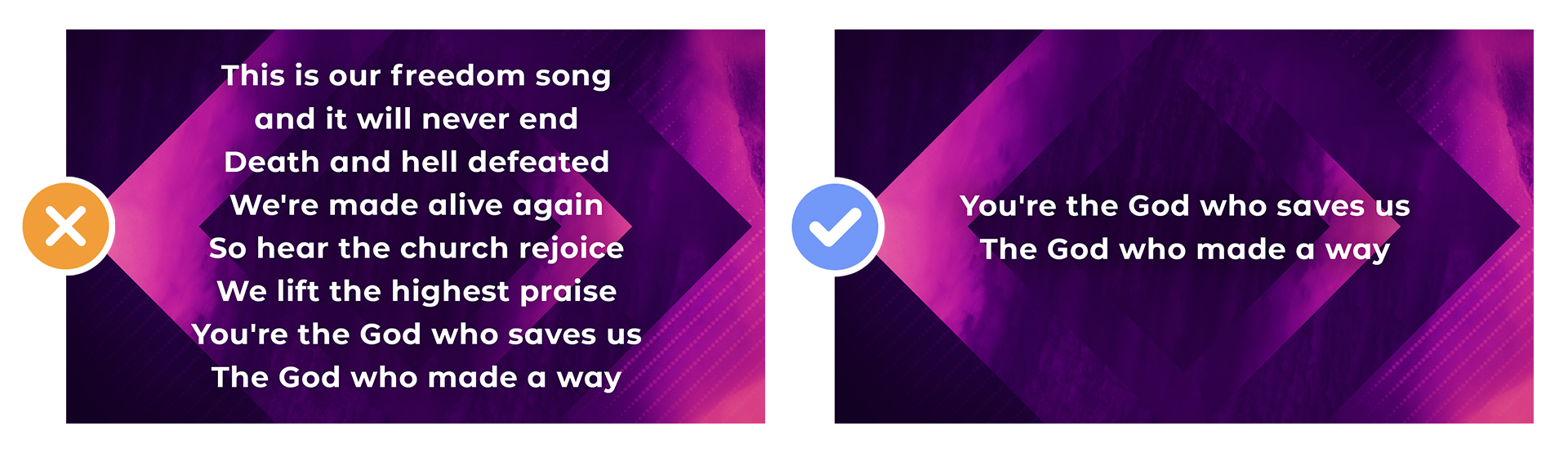
1. Too Many Lines of Text
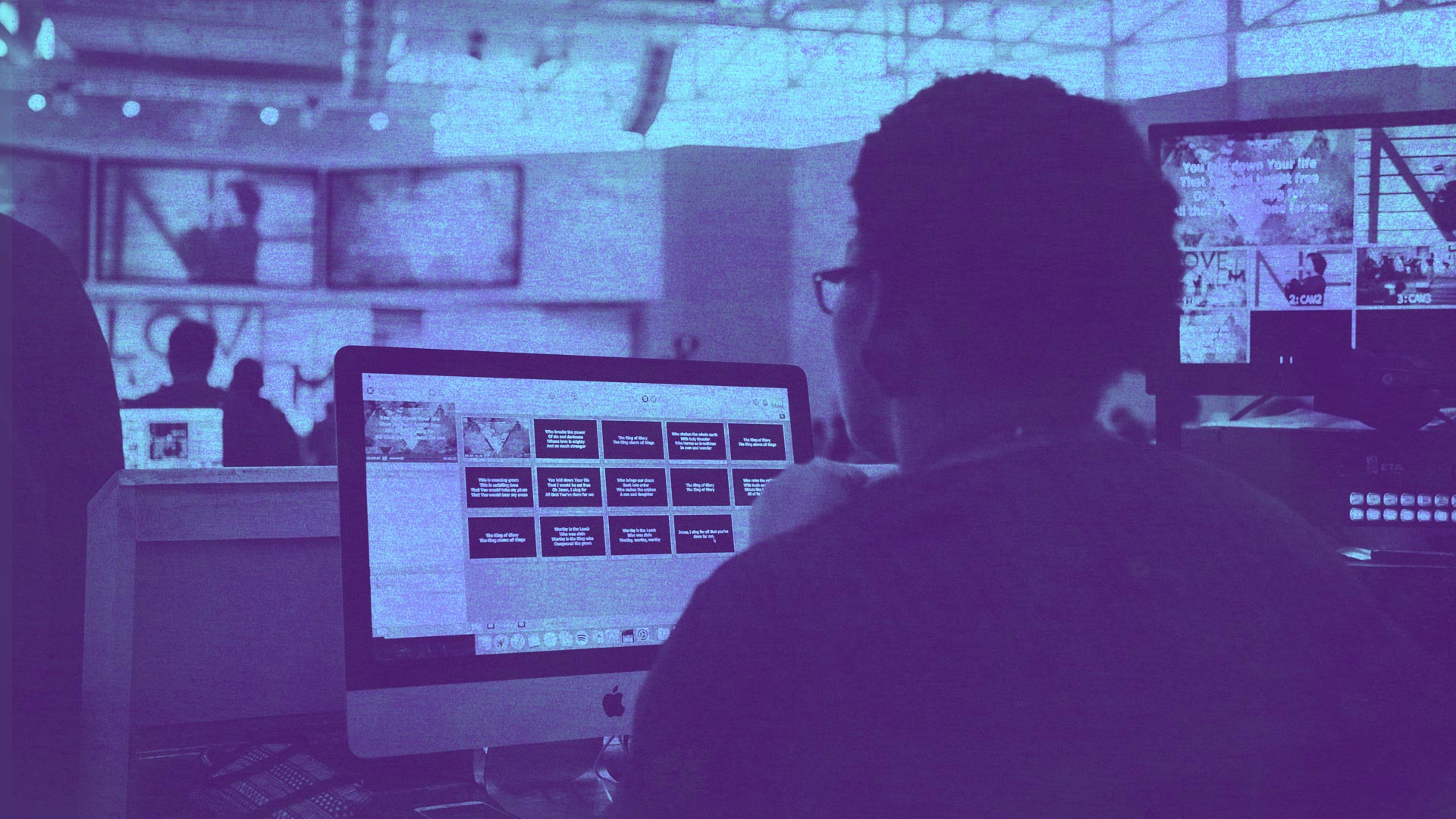
Don’t try to fit an entire song on one slide. Two to four lines of text is a balanced choice when determining how many lines should be presented on a single worship slide. It’s even better to stick to two to three lines because it leaves the screen uncluttered and easy for your community to find their place—whether they are familiar with the song or not.
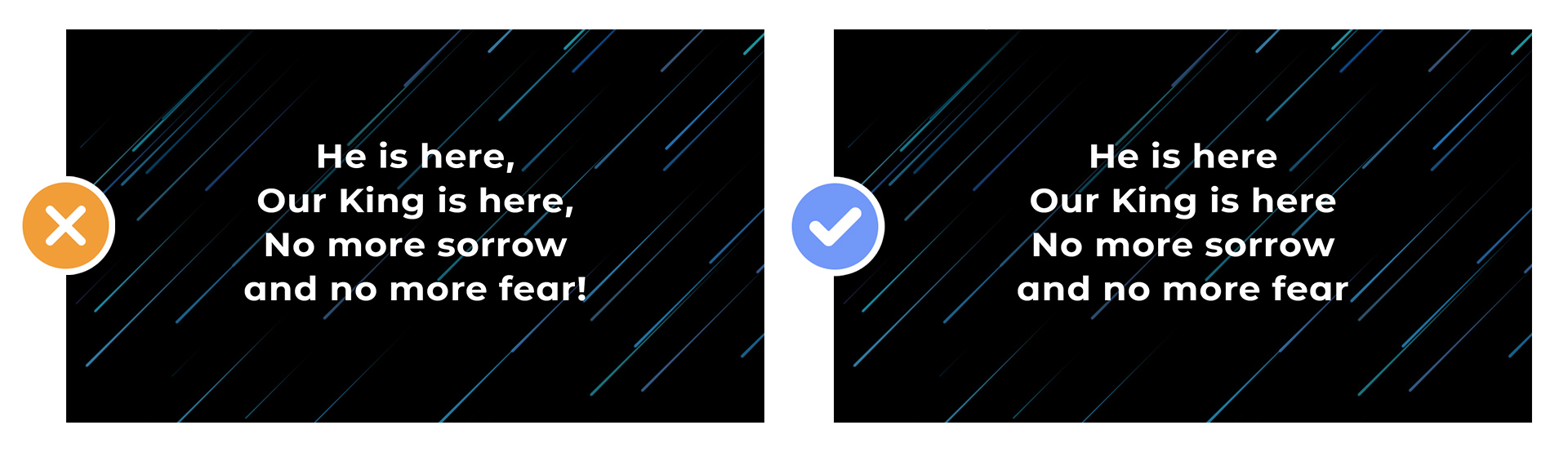
2. Unnecessary Punctuation
Avoid having your slides filled with unnecessary punctuation. The most common punctuation practice for worship lyrics is to eliminate everything that’s not needed and only keep the bare essentials. This comes from the school of thought that you are projecting lyrics and not sentences. Much like poetry, this practice does not follow all the standard rules of punctuation found in formal writing.
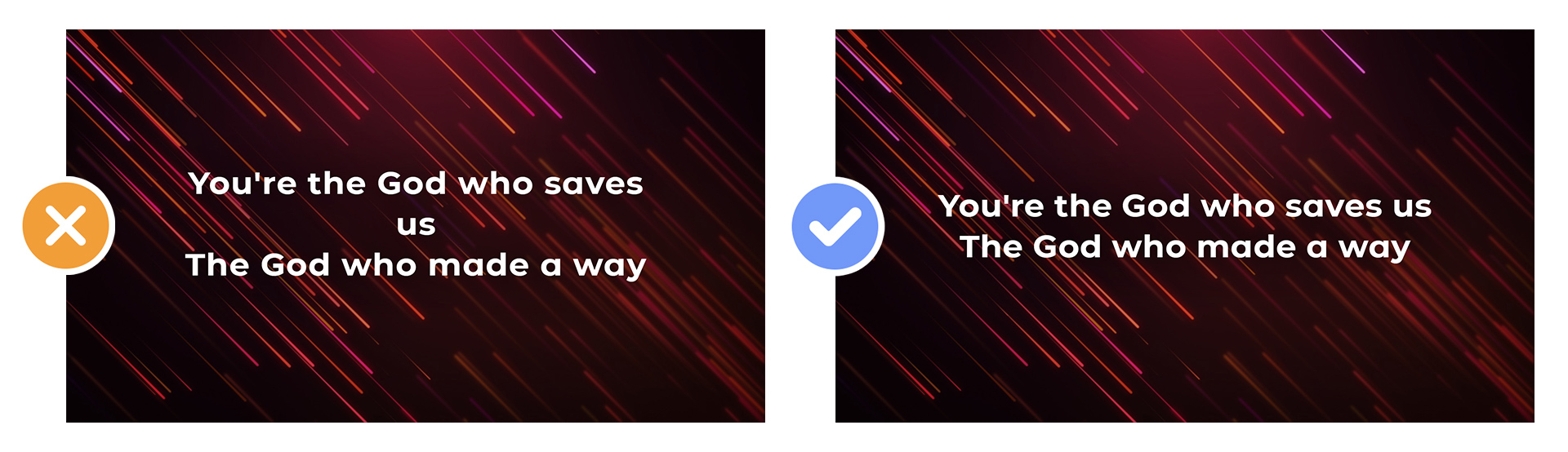
3. Orphans and Widows
When a line of text is too long for the space provided, the last word on the line will get pushed to a new line with a single word. This occurrence is called an orphan and is very unappealing when it comes to slide design. Even worse than an orphan is a widow. This is when a single word or line of text gets pushed to a new slide and leaves it widowed all by itself on the slide. One way to fix an orphan is to split a long line of text into two lines. Correct a widow by splitting a large block of text into two separate slides.
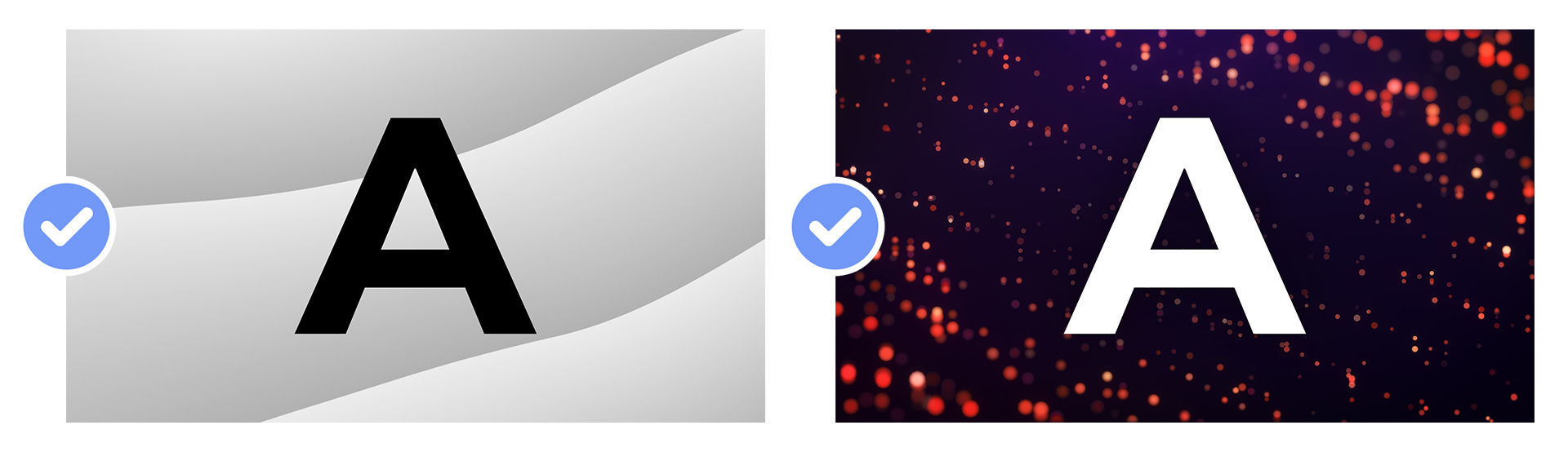
4. Incorrect Text Color
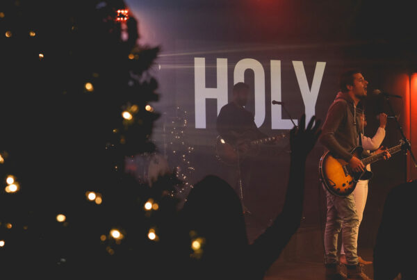
In the early days of video lyric projection, you would commonly see yellow text on a blue background. Although this does provide a high level of contrast and legibility, the look is unflattering and downright ugly. Today, the default should be white text on a black or dark background. When projecting text over a bright background, use either black text or a font effect like a black stroke.
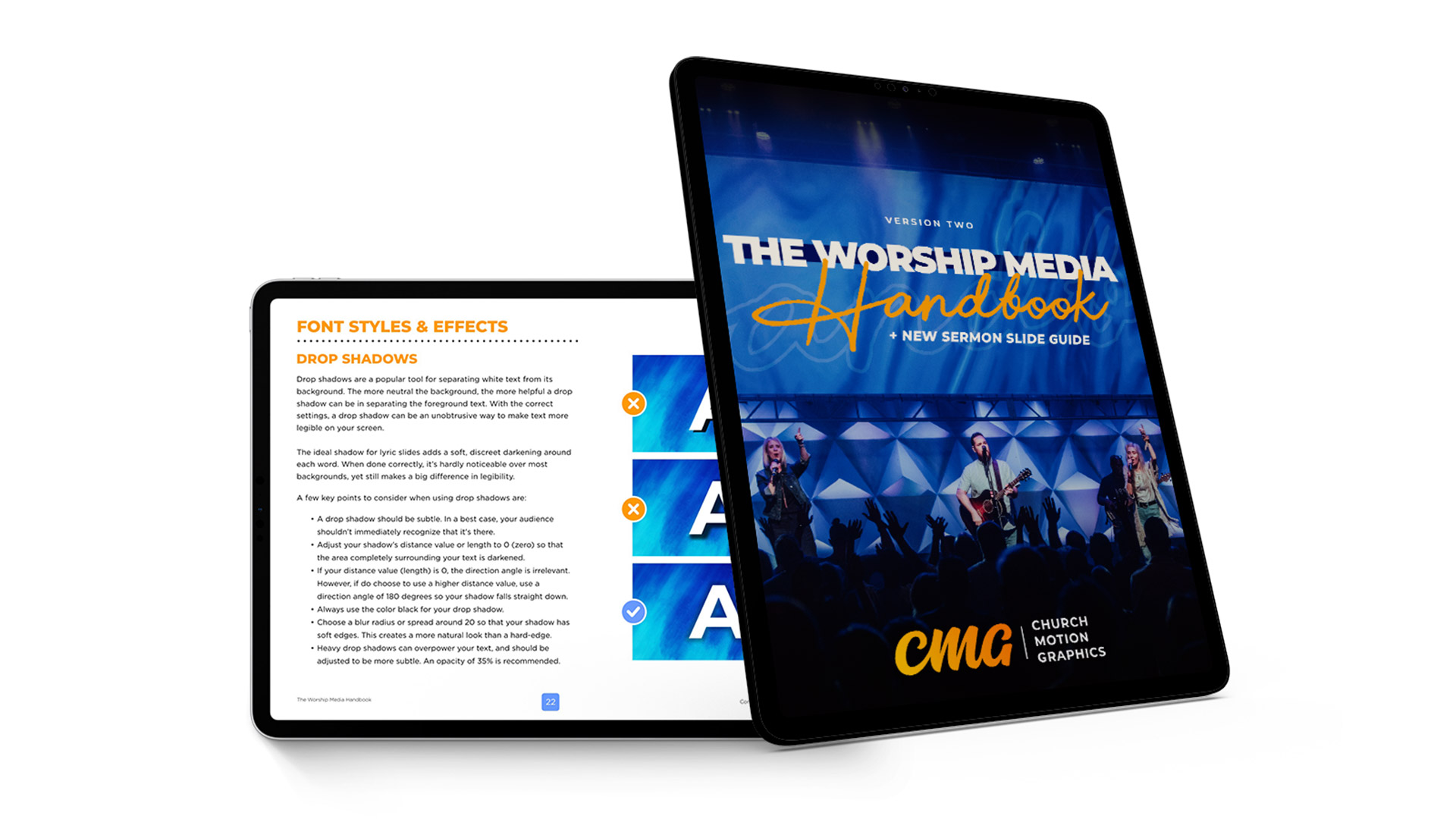
5. Overpowering Drop Shadows
Drop shadows are a popular tool for separating white text from its background. Heavy drop shadows can overpower your text and should be adjusted to be more subtle. An opacity of 35% is recommended. The more neutral the background, the more helpful a drop shadow can be in separating the foreground text. With the correct settings, a drop shadow can be an unobtrusive way to make the text more legible on your screen. The ideal shadow for lyric slides adds a soft, discreet darkening around each word. When done correctly, it’s hardly noticeable over most backgrounds, yet still makes a big difference in legibility.

 We’re Here To Help You Look Great
It can be difficult to design high-quality worship slides. At Church Motion Graphics, we have made this one easy. We just released Version 2 of The Worship Media Handbook. This 104-page PDF ebook is freshly updated for 2019, and will quickly train you and your church media team on how to prepare, edit and present worship slides with excellence.
Learn More About The Worship Media Handbook