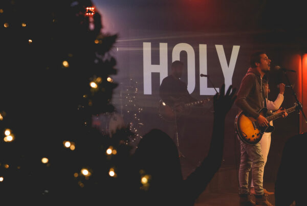
Fonts come in a wide range of styles all with varying degrees of emotion. When projecting lyrics it is common practice to use fonts that carry little to no emotion. This is desirable because you want your type to merely be a conduit for your messages. Only on occasion will you want the style of your type to carry a message itself.
If your presentation uses more than two fonts then you have used too many. Do not use more than two fonts throughout your entire presentation. This will keep things looking clean, professional and cohesive. Fonts are loners by nature. Don’t make them upset by forcing them to play together.
Readability trumps style. Never sacrifice the readability of your text or lyrics because of an artistic or creative choice. If what you are trying to communicate is unreadable then your message will be lost. Establish a default font that is readable and then introduce other design elements to add meaning and emotion.
To learn more about this topic read The Worship Media Handbook