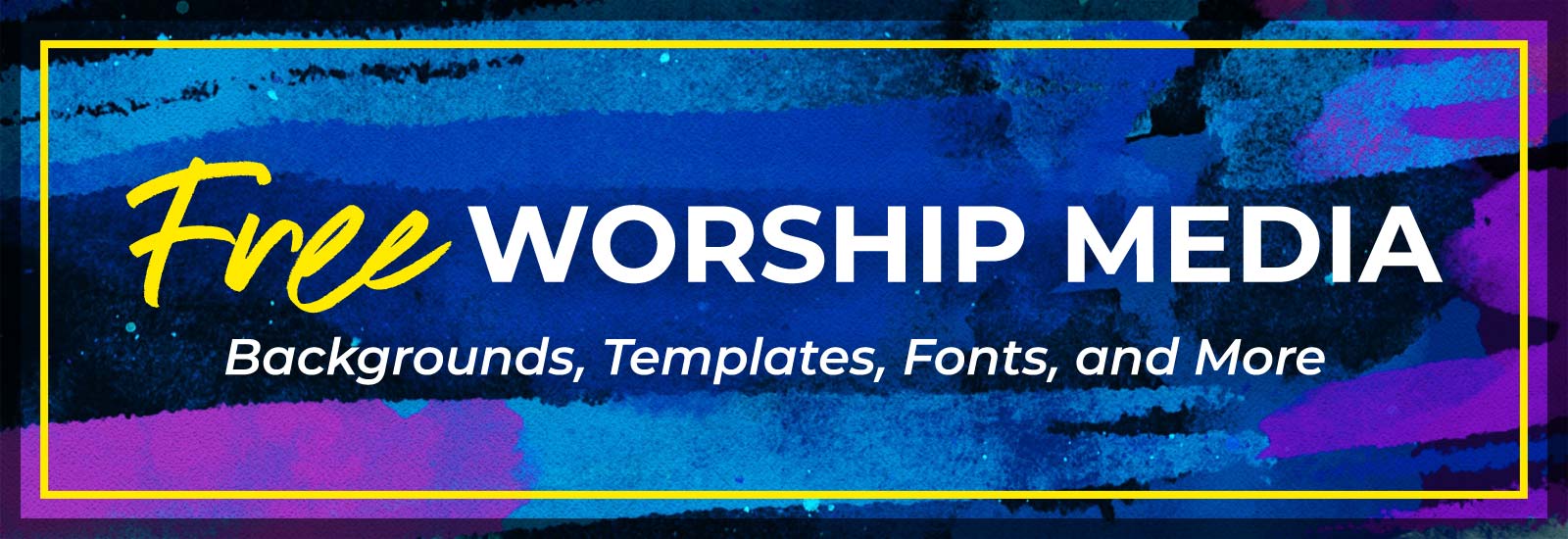
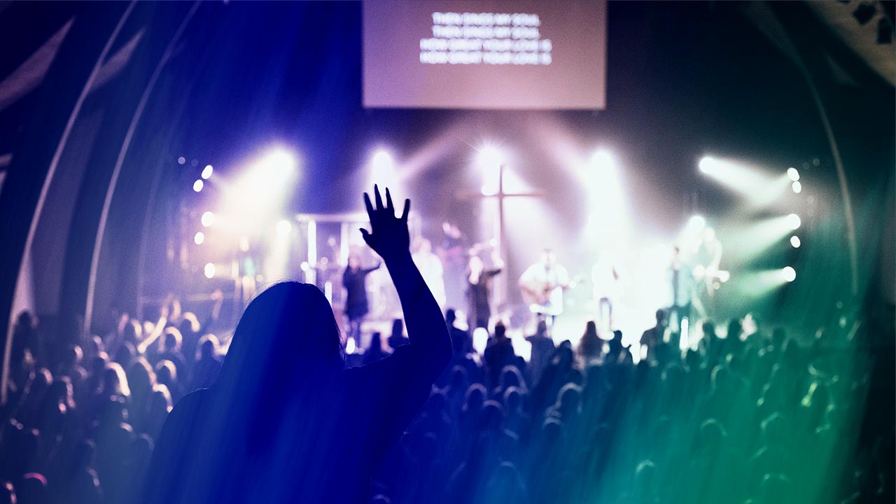
You have many typefaces (fonts) to choose from when projecting lyrics during your church service, youth group or worship concert. We wanted to introduce you to the most popular typefaces that churches are using, plus give a brief description of their history and critical properties. We hope that this list will provide you with a better understanding of these fonts and will help you make better typeface selections for worship slides in the future.
Our #1 Top Worship Lyric Typeface Choice
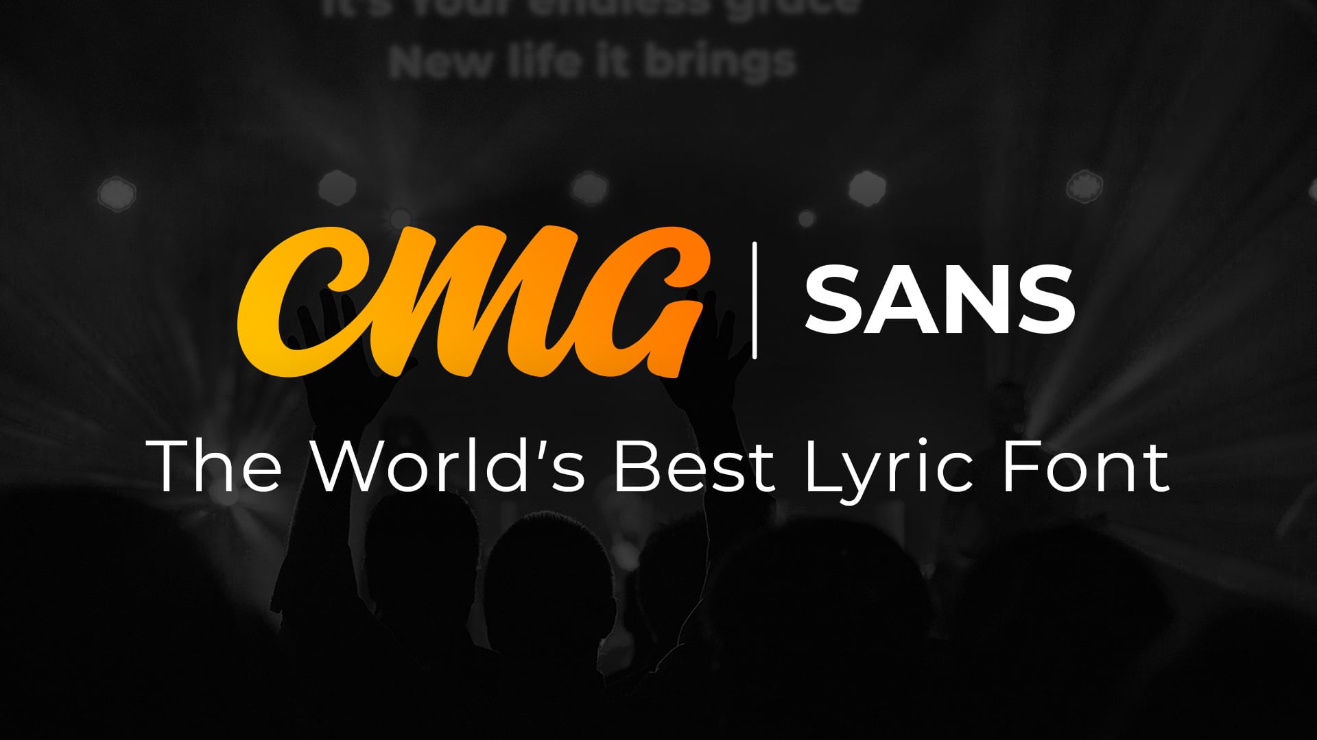 Since this post was originally published, we have created our own custom font to take the guesswork out of choosing a typeface for your worship slides.
CMG Sans was specially designed for church screens by combining the best qualities of the most popular typefaces for lyric projection. It’s available to download for FREE.
Download CMG Sans
1. Helvetica and Arial
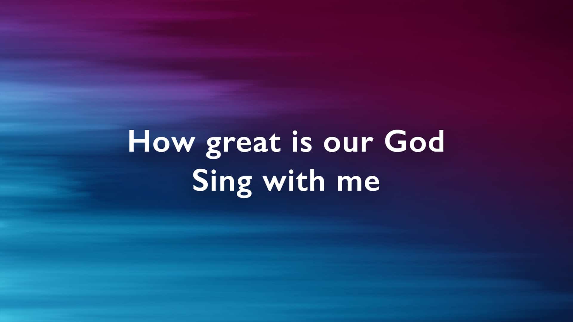
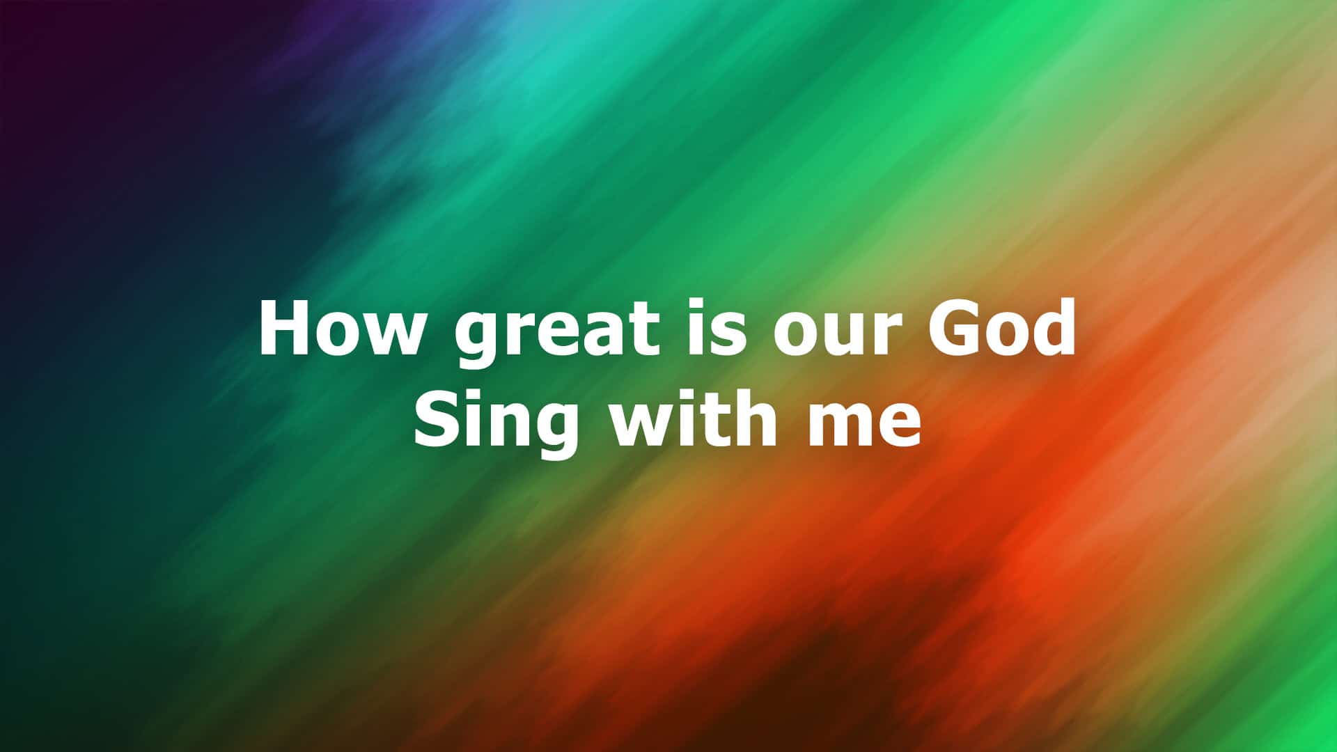
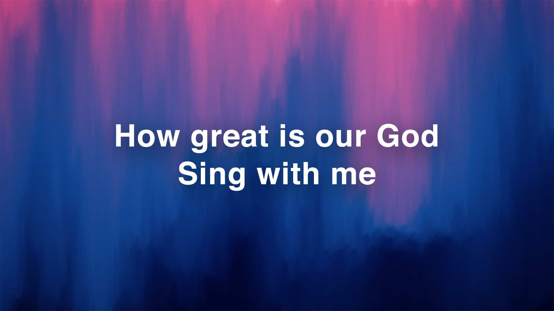 Background From The January 2018 CMG Pack
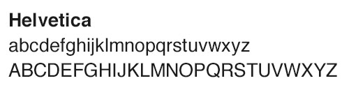
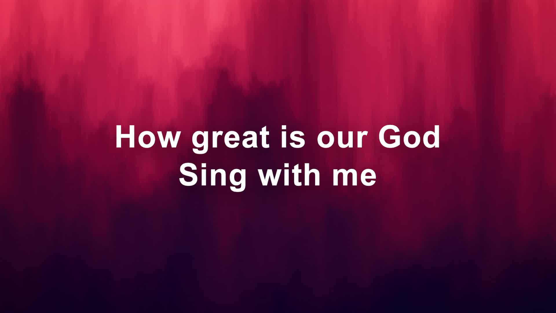
Helvetica is a widely used sans-serif typeface that was published in 1957. It was designed to be a neutral typeface with excellent clarity, no intrinsic meaning and used in a wide variety of signage. Over half a century later it is still a purposeful font that is in advertising, street signs, and print.
 Background From The January 2018 CMG Pack
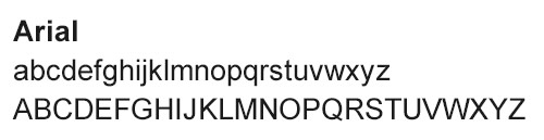
Arial was published in 1982 and was designed as a generic sans-serif typeface that is exceptionally versatile. It’s shape and form nearly match those of Helvetica, but it has more rounded edges, softer and fuller curves and the contours are more open. This typeface is perfect when you want a plain font that holds little emotion. Other Arial variations to experiment with are Arial Rounded, Arial Redux, and Arial Bold.
The differences between Helvetica and Arial are very subtle, and only a true typeface guru would be able to point out all the minute difference to you. Two of the main differences can are the capital “G” and “R”.
2. Century Gothic
 Background From The January 2018 CMG Pack
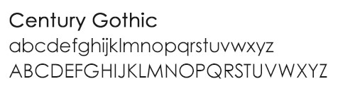
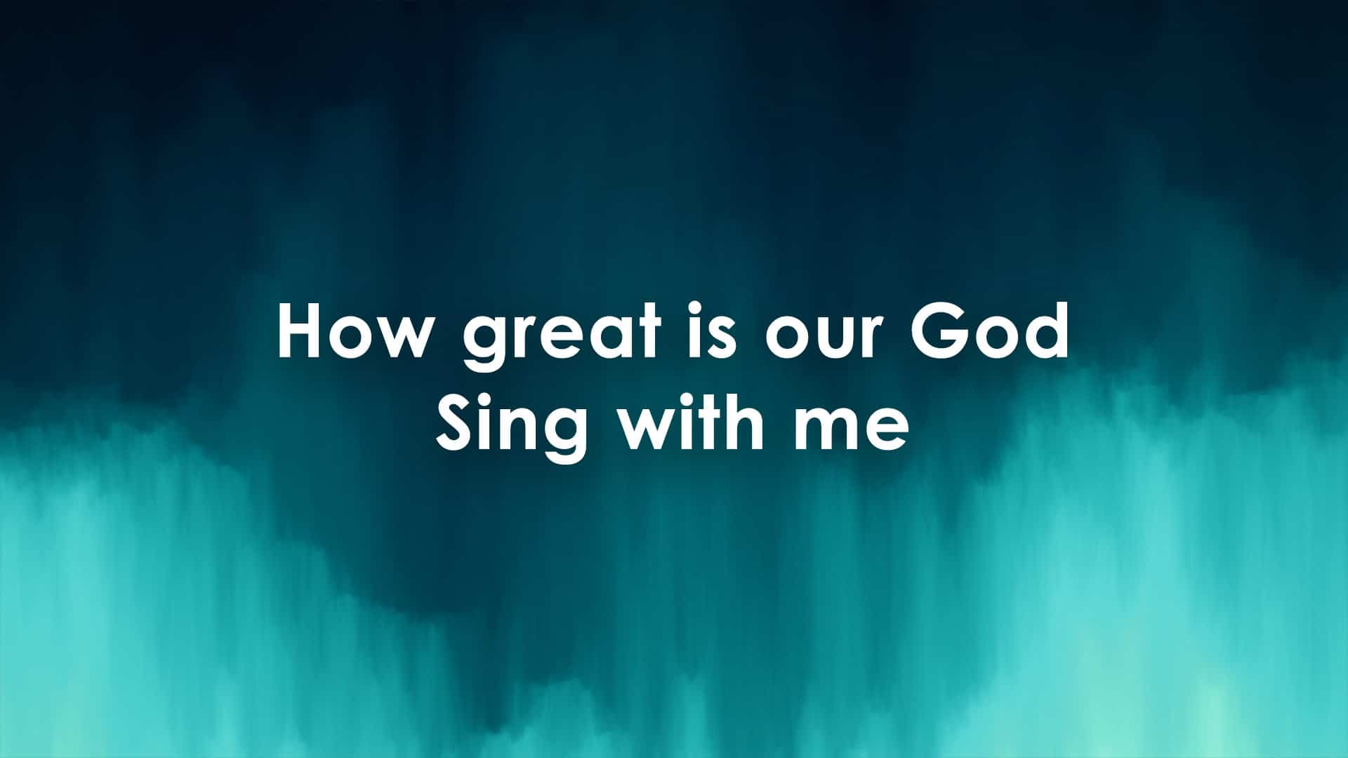
Century Gothic was published in 1991 and is a digital typeface. Its characteristics include even stroke widths, thin stroke widths, large x-height, single-story lower case “a” and “g” and wide letters. This geometric sans-serif typeface has nice rounded letter forms and a crisp, clean feel. If you are looking to boost the visibility of your text try using Century Gothic Bold instead.
3. Myriad Pro
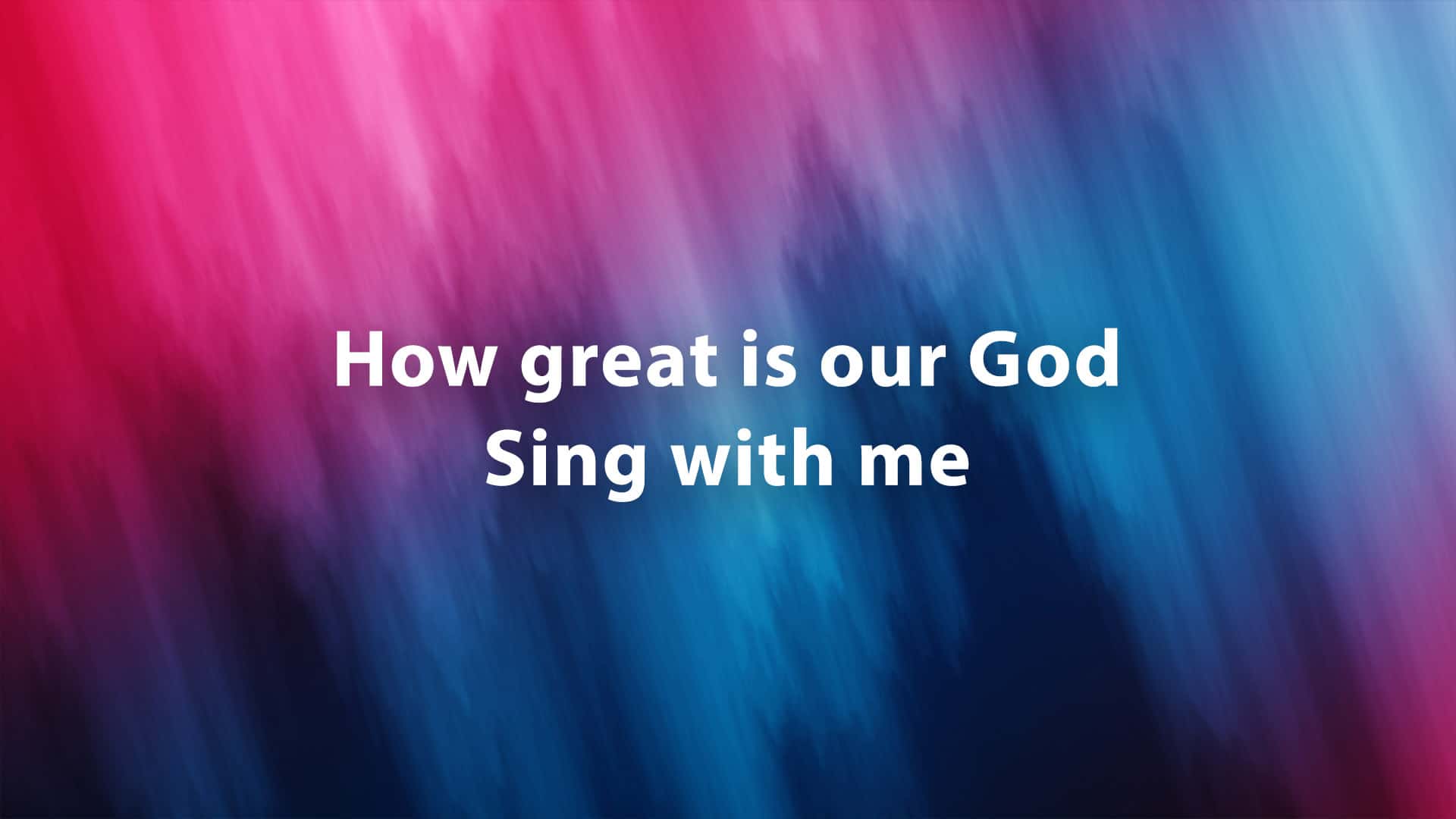 Background From The January 2018 CMG Pack
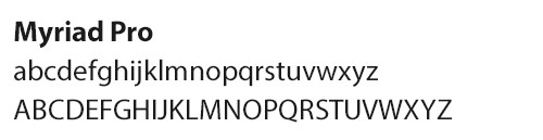
Myriad Pro is a humanist sans-serif typeface designed for Adobe Systems and published in 2000. The typeface is best known for it’s usage by Apple. Myriad Pro has a clean feel with beautifully rounded curves, nicely proportioned line-weights and unique characteristics like the “y” descender and slanting “e” cut. Try using Myriad Condensed if pressed for horizontal space or Frutiger for a similar typeface alternative.
4. Lucida Grande
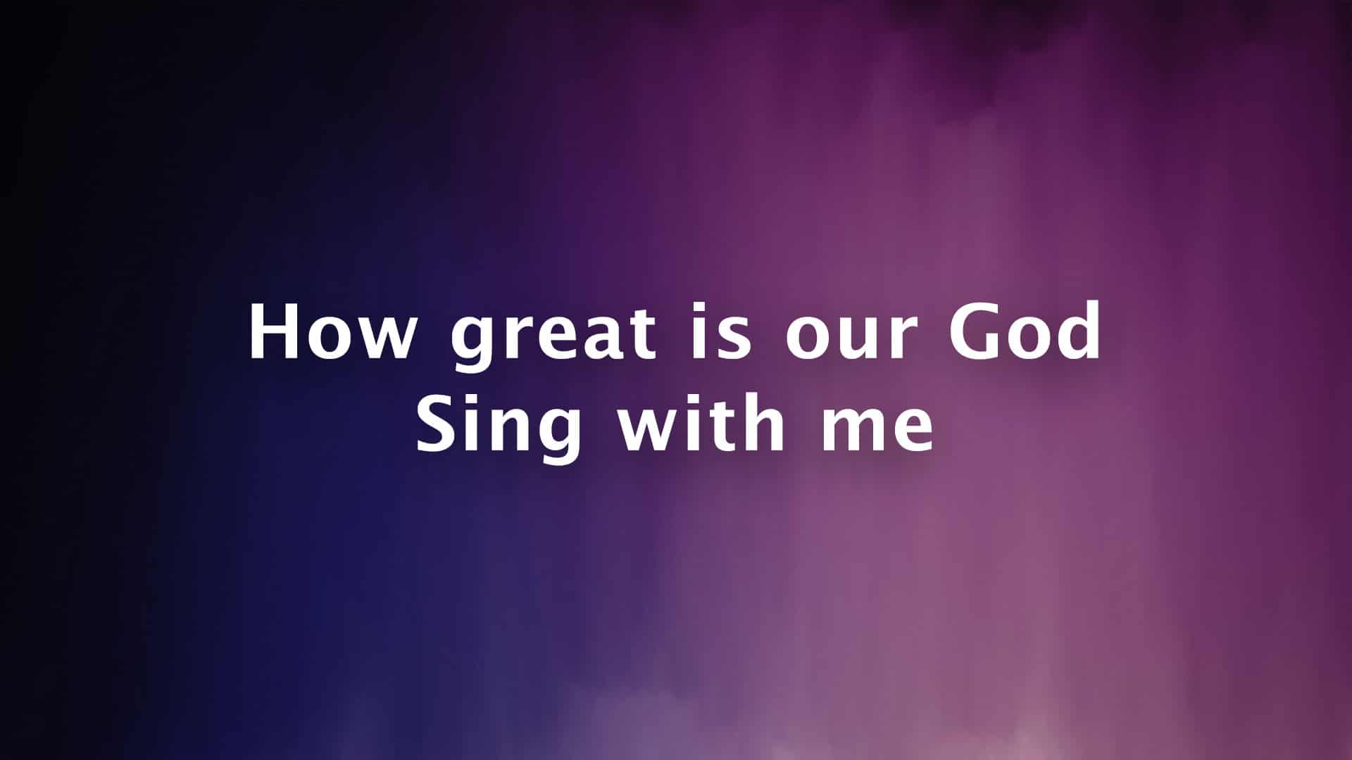 Background From The January 2018 CMG Pack
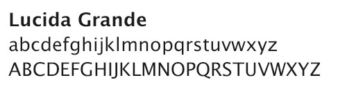
Lucida Grande is another humanist sans-serif typeface that is a version of the Lucida Sans extended character set that was published in 1985. This typeface is used throughout the Mac OS X user interface since 1999. Its form is unique with straight lines, thick line-weights and minimal creative flare that makes this typeface have a “computer terminal” feel. Try this typeface if you are looking to increase text readability. Other fonts to try are Lucida Casual and Lucida Sans for various other design applications.
5. Gill Sans
 Background From The January 2018 CMG Pack
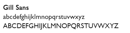
Gill Sans is another beautifully formed typeface much like Myriad Pro. It was initially designed in 1926 and later released in 1928. The uppercase letters of Gill Sans are modeled on the monumental Roman capitals and hold lovely broad standing symmetrical forms. Gill Sans has similar characteristics as the typeface Futura, but has less of a geometric, mechanical feel. The lowercase letters were modeled from Carolingian script and this influence is noticed in the lowercase “a” and “g”. Other exciting variations of this typeface include Gill Sans Condensed and Gill Sans Extra Bold.
Gil Sans is the most narrow typeface on our list and is useful if you are pinched for horizontal space or using a 4:3 screen aspect ratio.
6. Gotham
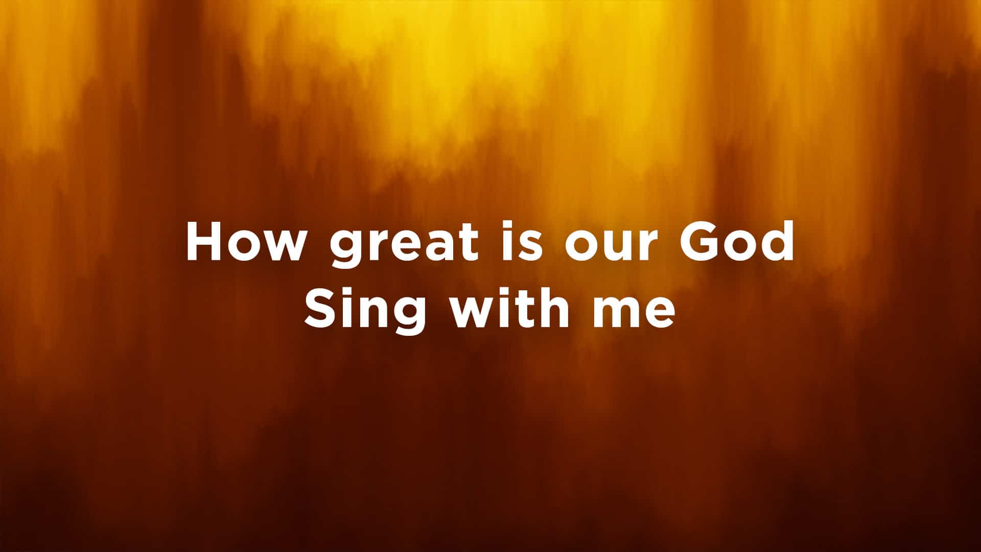 Background From The January 2018 CMG Pack
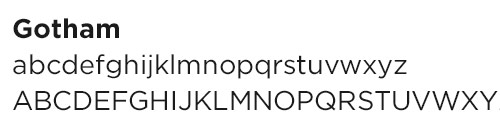
Gotham is a family of geometric sans-serif digital typefaces published in 2000. This typeface was initially commissioned by GQ magazine, whose editors wanted a “geometric structure” that would look masculine, new and fresh. The designers have done a great job at reducing it forms to the bare, efficient essentials and eliminated all undesirable, local or ethnic elements. This clean, sleek typeface is perfect for the creative-modern church that has a trendy masculine side. Other fonts to consider are Futura, Gotham Thin, Gotham Bold and Gotham Rounded.
Gotham is the typeface Church Motion Graphics has chosen for its creative branding.
7. Tahoma
 Background From The January 2018 CMG Pack
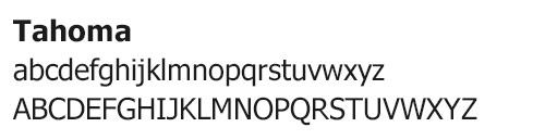
Tahoma is another humanist sans-serif typeface that was designed in 1994 for the Microsoft Corporation for Windows 95. While similar to the typeface Verdana, Tahoma has a narrower body, less generous counters, much tighter letter spacing and a more complete Unicode character set. It was first initially designed as a bitmap font, meaning it will “carefully wrap” around the pixels it covers. One distinct advantage that it has over such typefaces as Arial for the use of technical reading materials is that the uppercase “I” is distinguishable from the lowercase “l”. Like Lucida Grande, this font has a more technical feel and a distinct “computer terminal” look.
8. Bonus Typefaces
When we surveyed churches in our Facebook Group, we got a lot of typefaces besides these seven. Here are a few more that were given to us:
- Montserrat
- Railway
- Avenir
- Bebas Neue
- Open Sans
- Proxima Nova
What typeface do you prefer to use to project your worship lyrics?
Want even more typefaces? Download The Essential Guide To The Best Free Fonts in our free Church Slide Design Makeover.