The art of visual worship will move you beyond just pushing buttons on a Sunday morning to creating meaningful experiences for your audience that foster deeper engagement. The placement of the lyrics on your screen doesn’t have to be sterile and should be arranged in a specific way for a specific reason. Here are five ideas for your projected song lyrics that will help you achieve this goal.
1. Left Justified Song Lyric Text
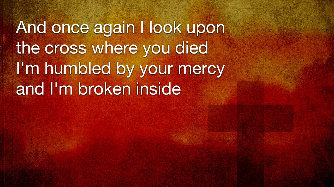
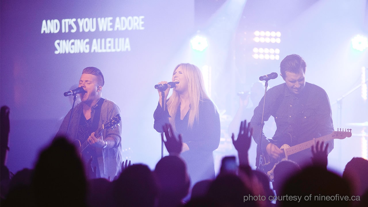
Aligning your text to the left can add a new dimension to your lyrics if your audience is accustom to having it centered all the time. This can be especially helpful if there is an element on the right side of the screen that you do not want to cover up with type.
2. Emphasizing Keywords and Phrases in your Lyric Text
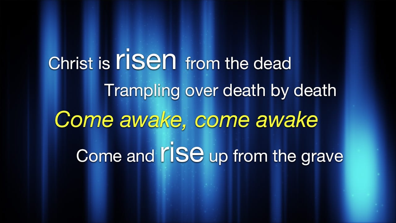
When singing a song, some words are given extra emphasis so why not put extra emphasis on the lyrics themselves? Sparingly, try increasing the font size, adding an italic or bold style and using a splash of color. Be careful not to make the lyrics harder to read with styled adjustments. Some additional tweaking will be needed to accommodate the changes such as increasing the line height of your text and staggering your lines from the left and right.
3. Vertically Aligning your Lyric Text to the Top
There are a lot of beautiful motions available with graphical elements on the bottom of the screen. Instead of keeping your lyrics in the center of your screen, how about you try vertically aligning them to the top? This will help separate your lyrics from the lower graphics and leave more room for your elements to breath.
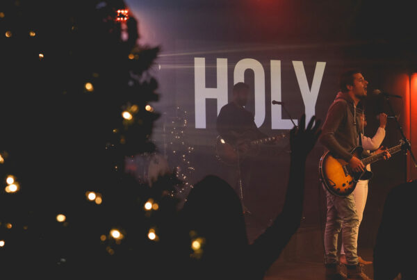
4. Font Type Change for your Projected Lyrics
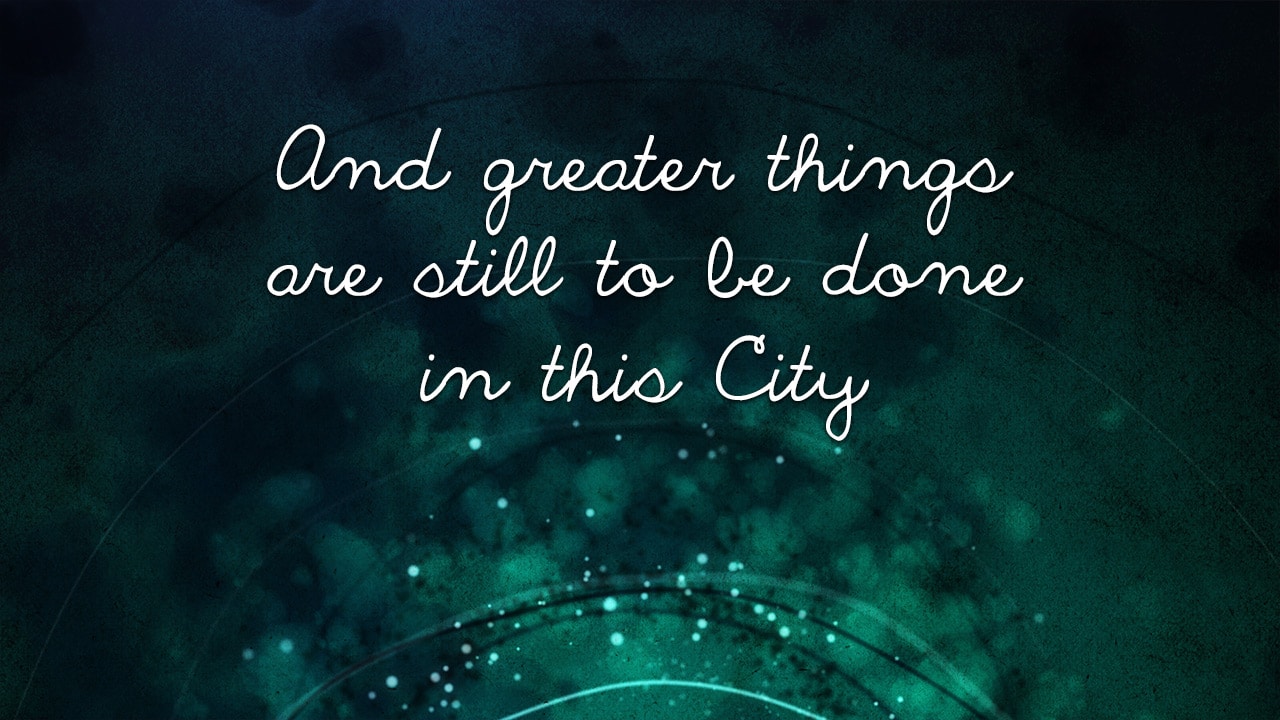
Common font types that churches like to use for song lyrics are: Helvetica, Century Gothic, Gotham, Myriad Pro, Lucida Grand and of course the most holy font of all, Papyrus (just kidding). Bold is often chosen to increase visual contrast and will usually make your lyrics easier to read. It is perfectly acceptable and encouraged to use one font type throughout your entire service, but why not try mixing it up a little to create emphasis and interest? Choose a font that complements your standard one, fits with the song and is not difficult to read or is distracting to your audience. Font: The Only Exception
5. Black Backgrounds and Visual Silence
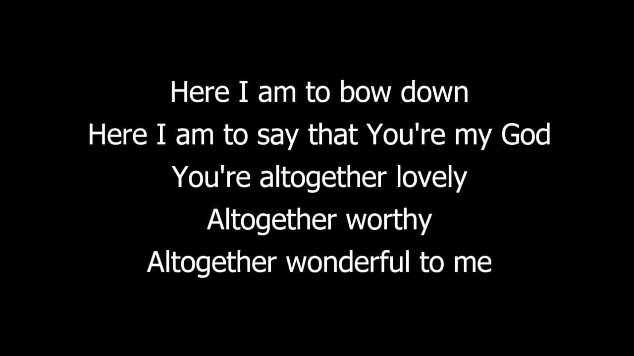
If you commonly use moving backgrounds or images behind your lyrics than this technique will bring a lot of value to your visual experience. Throughout a service there are times when you need to dial back the flare and introduce visual silence into your environment. Black backgrounds will help your audience to focus on the words and not be distracted. This is perfect for slower songs, times of reflection and response. Black backgrounds can also be effectively used during the verses of a songs and then transitioned into a motion or still for the chorus.
How are you projecting song lyrics at your church?
Need help composing, editing and presenting worship slides? Download The Worship Media Handbook by Jeff McIntosh.